
bubble font Typography is more than just choosing the right font for your text—it’s about creating a visual identity that communicates the essence of your brand, product, or message. One such font style that has gained immense popularity for its playful and lively vibe is the bubble font. This unique font style, characterized by its rounded, inflated, and often bold shapes, adds a touch of fun and creativity to designs. Whether you’re working on a logo, poster, or website, bubble fonts can help you stand out and grab attention. In this guide, we’ll explore everything you need to know about bubble fonts, including their definition, benefits, how to use them, and common mistakes to avoid.
What is Bubble Font?
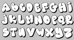
Bubble font refers to a style of typography that features rounded, thick, and inflated letterforms, often resembling bubbles or soft shapes. This font style is typically bold and highly legible, making it perfect for grabbing attention. Unlike traditional serif or sans-serif fonts, bubble fonts are informal, fun, and friendly, making them ideal for designs that aim to convey a lighthearted or youthful feel.
The concept of bubble fonts has evolved over time, with early uses seen in comic books, advertisements, and children’s media. The exaggerated, playful shapes of bubble fonts make them visually appealing and effective for drawing attention in various contexts. Today, they are widely used in branding, digital design, and social media content. Some popular examples of bubble fonts include “BubbleGum,” “Lobster,” and “Comic Sans,” though the former has become more stylized and sophisticated over the years.
Bubble fonts differ from other types of fonts due to their thick, smooth curves that often resemble inflated objects. These fonts are often used to convey a sense of warmth, friendliness, and fun, making them ideal for brands targeting younger audiences or informal settings. Whether it’s a logo for a children’s toy brand or a social media post promoting a fun event, bubble fonts have the ability to grab attention and evoke a playful atmosphere.
The Benefits of Using Bubble Font in Design
Visual Appeal and Playfulness
One of the key benefits of using bubble fonts is their inherent visual appeal. The thick, rounded shapes of the letters create a soft, approachable vibe, making them ideal for playful designs. When used in the right context, bubble fonts instantly make your design more engaging, encouraging the audience to take notice. This makes them perfect for brands or campaigns that want to convey a sense of fun and lightheartedness.
Bubble fonts are especially effective for designs targeted at children or young audiences. Their friendly and approachable aesthetic creates an emotional connection, evoking feelings of nostalgia or joy. From packaging for kids’ products to animated series logos, bubble fonts are widely used to create a memorable visual identity. Moreover, the exaggerated shapes make the text easy to read, ensuring that your message stands out even in crowded or busy designs.
Increased Readability and Impact
Bubble fonts are not only visually appealing, but they also tend to be highly legible. The large, rounded shapes allow the text to be easily read from a distance, making bubble fonts an excellent choice for headlines, banners, and posters. The bold nature of these fonts ensures that your message gets noticed, even in highly competitive visual spaces like websites or social media feeds.
In addition to their readability, bubble fonts make a bold statement. Their inflated shapes add weight to the text, making it stand out against other design elements. This makes them ideal for creating eye-catching headlines or focal points in your designs. Whether you’re promoting an event, highlighting a new product, or creating an impactful brand name, bubble fonts can help you achieve the attention-grabbing effect you desire.
Versatility Across Platforms
Another significant advantage of using bubble fonts is their versatility. They can be effectively utilized across various platforms, including print, digital, and social media. Whether you’re designing a flyer, a website, a logo, or an Instagram post, bubble fonts adapt seamlessly to different formats and mediums.
On digital platforms, bubble fonts are particularly useful for catching the attention of viewers who are scrolling through social media feeds. Their playful, bold shapes stand out against other, more traditional fonts, helping your content get noticed. Similarly, bubble fonts work well on websites and promotional materials, adding a touch of whimsy and fun to otherwise straightforward designs.
How to Use Bubble Font in Your Designs
Choosing the Right Bubble Font
When incorporating bubble fonts into your designs, it’s crucial to choose the right type for your project. Not all bubble fonts are created equal, and selecting the wrong one can impact the overall feel of your design. Consider factors such as your target audience, the theme of your project, and the medium where the design will be used. For example, a bubbly font with exaggerated curves may work well for a children’s toy brand, but it might not be suitable for a corporate website.
Popular bubble fonts, such as “BubbleGum” or “Lobster,” are widely recognized for their playful and rounded design. These fonts are often used in casual contexts where a friendly, approachable tone is desired. However, you may also find more stylized bubble fonts that have a contemporary or even sophisticated edge, making them suitable for a wider range of designs.
Styling Tips for Bubble Fonts
Once you’ve chosen the right bubble font, you can customize it to fit your design’s needs. One of the most effective ways to enhance a bubble font is by experimenting with color. Bright, bold colors such as neon pinks or blues can add energy and excitement, while pastel hues might be more appropriate for a soft, youthful look. You can also play with gradients or textures, such as glossy or matte finishes, to give the text a more dynamic appearance.
Additionally, adjusting the size and spacing of the letters can improve the readability and overall look of the text. When working with bubble fonts, it’s essential to ensure that the text doesn’t appear too crowded or cluttered. Proper letter-spacing and line-spacing will ensure your bubble font retains its readability while maintaining a clean and aesthetically pleasing layout.
Best Design Practices
Bubble fonts work best when they are used sparingly and thoughtfully. To avoid overwhelming your design, combine bubble fonts with other typography styles, such as serif or sans-serif fonts. This allows the bubble font to stand out while maintaining a sense of balance and professionalism. For instance, use a bubble font for headlines or key phrases and complement it with a more neutral font for body text.
Incorporating bubble fonts into logos or branding materials is an excellent way to infuse personality into your design. Just be sure to choose a font that aligns with your brand’s values and target audience. On websites and digital platforms, bubble fonts can be used for call-to-action buttons, headings, or feature banners, providing a touch of fun without detracting from the user experience.
Common Mistakes to Avoid When Using Bubble Font
Overuse and Misplacement
While bubble fonts are fun and eye-catching, they can lose their effectiveness if overused. Using bubble fonts for every piece of text in your design can lead to visual clutter and make the message difficult to decipher. To avoid this, use bubble fonts strategically—reserve them for headlines, product names, or call-to-action buttons, while pairing them with other fonts for the body text.
Choosing Inappropriate Fonts
Not all bubble fonts are suitable for every project. A playful, cartoonish bubble font may not be ideal for a formal business presentation or luxury branding. When selecting a bubble font, ensure it aligns with the overall tone of your project and appeals to your target audience. For more professional designs, consider using a more refined or stylized bubble font that maintains the playful elements while looking more sophisticated.
Ignoring Readability
Readability is crucial in design, and bubble fonts should never compromise it. Avoid overly complex bubble fonts that may be hard to read, especially when the text is displayed in smaller sizes. Keep the shapes simple and the spacing adequate to ensure legibility. Also, make sure there is enough contrast between the text and the background to make the bubble font stand out.
Ignoring Mobile Compatibility
When designing for digital platforms, it’s important to test how bubble fonts look on different screen sizes, especially mobile devices. Ensure that your chosen bubble font is responsive and doesn’t appear distorted on smaller screens. Additionally, make sure the font maintains readability across various devices to provide a seamless user experience.
Conclusion
Bubble fonts are a fun, versatile, and eye-catching typography choice that can add personality and playfulness to any design. Whether you’re creating a logo, a website, or a social media post, bubble fonts can help you make a bold statement and engage your audience. By selecting the right bubble font, styling it thoughtfully, and using it strategically, you can enhance your designs and create a memorable visual experience.